Highlights
- Premier League clubs have started to release their kits for the 2024/25 season.
- Arsenal’s kit sees them have a cannon as their crest instead of their traditional badge for the first time since 1990.
- Brentford have opted to use their 2023/24 kit, as Man City and Liverpool took inspiration from history.
Every year it is the same story. As one Premier League campaign ends, the focus immediately turns towards the next one. Acting like a circle of life, the story surrounding England’s richest league is never-ending — and the kits each team wears play a part in that.
The 2023/24 campaign saw Manchester City win the title after a titanic battle with Mikel Arteta’s Arsenal. Pep Guardiola, one of the greatest managers of all time, showed the experience and composure needed at the crucial moments, whilst the Gunners hardly did anything wrong; they just couldn’t beat a team which is so often seen as unbeatable.
Yet as the season ended, the kit releases started. As Liverpool said farewell to Jurgen Klopp and accidentally welcomed Arne Slot post-match, the Reds were wearing their new 2024/25 kit. It’s received criticism over the years for wearing a new jersey before the close of the season, but that’s the reality of modern football; money drives everything.
Several shirts have been released for the 2024/25 campaign have been released. We have outlined all of them below as the dawn of a new historical season nears.
|
Premier League 24/25 Kits |
|||||
|---|---|---|---|---|---|
|
Team |
Home Kit Released? |
Away Kit Released? |
Third Kit Released? |
Home Release Date |
|
|
Arsenal |
Yes |
Yes |
Yes |
16th May 2024 |
|
|
Aston Villa |
Yes |
No |
23rd July 2024 |
||
|
Bournemouth |
Yes |
Yes |
Yes |
3rd August 2024 |
|
|
Brentford |
Yes |
Yes |
Yes |
4th July 2023 |
|
|
Brighton & Hove Albion |
Yes |
Yes |
15th July 2024 |
||
|
Chelsea |
Yes |
Yes |
No |
15th July 2024 |
|
|
Crystal Palace |
Yes |
Yes |
13th June 2024 |
||
|
Everton |
Yes |
Yes |
17th July 2024 |
||
|
Fulham |
Yes |
Yes |
TBC |
3rd July 2024 |
|
|
Ipswich Town |
Yes |
Yes |
Yes |
6th July 2024 |
|
|
Leicester City |
Yes |
Yes |
TBC |
6th July 2024 |
|
|
Liverpool |
Yes |
Yes |
No |
1st May 2024 |
|
|
Manchester City |
Yes |
Yes |
Yes |
16th May 2024 |
|
|
Manchester United |
Yes |
Yes |
Yes |
1st July 2024 |
|
|
Newcastle United |
Yes |
No |
Yes |
7th June 2024 |
|
|
Nottingham Forest |
Yes |
Yes |
No |
19th July 2024 |
|
|
Southampton |
Yes |
Yes |
Yes |
16th July 2024 |
|
|
Tottenham Hotspur |
Yes |
Yes |
No |
4th June 2024 |
|
|
West Ham United |
Yes |
Yes |
3rd July 2024 |
||
|
Wolves |
Yes |
No |
3rd July 2024 |
||

Related
Premier League 2024/25: Start Date, Fixtures, Teams, Tickets & More
It’s not long until the Premier League restarts as Arsenal search for their first title since 2004.
Arsenal
Home
Arsenal came so close to Premier League glory in 2024. They beat Everton on the final day of the season, but it wasn’t enough to complete the job. It was the second year in a row that they came close, yet they will be hoping ‘third time is the charm’ to stop Man City’s dominance.
The Gunners released their 2024/25 kit just before the end of the previous campaign. Naturally, the main bulk of the jersey is red. They would never switch to another colour, yet they have opted to add more white to their kit. It’s slightly controversial, if anything, with the basic colour running down the sleeves and arms. Traditional Adidas stripes accompany it to create a kit which definitely catches everyone’s attention.
Meanwhile, it is believed that it celebrates the core symbols of the club — and, for the first time since the 1989/1990 season, they are using a cannon as the main crest instead of their traditional badge. When they released it, the club said: “The home kit is crafted for performance and to give our players the confidence to play under pressure.
“This lightweight jersey features the latest in Adidas technology and is created in close collaboration with the Arsenal men’s and women’s teams.”
Away
Arsenal’s new away kit has taken a fresh approach compared to the club’s tradition. Designed by Labrum London founder Foday Dumbaya, the inspiration is based on the colours of Africa. The shirt features a pan-African colour palette with subtle zig-zag stripes on the shoulders and further down the jersey. It also features red and green trim across the shoulders and arms.

Related
Ranking the Best Arsenal Goalkeepers in the Premier League Era
Arsenal have had some unbelievable shot-stoppers over the years.
Third
UPDATE: 2024/08/12 11:38 BST BY NATHAN LINLEY
Arsenal unveil new Adidas Trefoil third kit.
One of many Trefoil Adidas football kits released this season, Arsenal marked this with a design that is similar to the Northern Lights, with shades of green and purple throughout the jersey. The Gunners have opted to go with navy shorts and socks with mint green stripes, with the Trefoil logo also front and centre on the socks.
This logo hasn’t been used on an Arsenal kit since 1992 and this could quite easily become a fan favourite. Although typically alternative kits aren’t worn that option, it will be interesting to see which games Mikel Arteta’s side choose to wear this during the 2024/25 campaign.
Aston Villa
Home
It’s a new era at Villa Park and accompanied by one of the best kit reveals in recent times, Aston Villa marked their new collaboration with kit manufacturer Adidas in style. The Midlands-based outfit went for a vintage look with a modern twist for their brand new home shirt. With a maroon base and cyan trim, along with the classic Adidas stripes, we may have what turns out to be a classic kit already.
The shirt is accompanied by the club’s new kit sponsor Betano along with the all-new Villa crest. This follows on after the Villains had severe problems during the 2023/24 campaign with previous kit supplier Castore, who they were quick to part ways with. Villa have yet to reveal their away shirt for the new campaign.
Bournemouth
Home
An instant classic? We certainly think so. Bournemouth released an incredibly slick home jersey for the new season with subtle detailing which could arguably make this one of the kits of the season.
The Cherries looked at the kit that they wore during the 2014/15 campaign which saw them promoted to the Premier League as Championship champions for the first time in their history. Their Umbro kit includes two red stripes on a black shirt, with a round collar and subtle gold trim throughout.
Away
The Cherries opted to take a trip back to the 1990s with their new away shirt, which features an incredibly stylish colourway featuring shades of mint and purple on a predominantly back shirt. It also has purple cuffs and trim around the colour, along with a gold sponsor.
It takes inspiration from their 1992 away jersey which sported a similar colour scheme and pattern on a bolder scale. This has become a bit of a staple shirt among the Bournemouth fanbase so they will be delighted to see the return of this for the 2024/25 campaign.
Third
Inspired by the city’s natural elements and iconic coastline, Bournemouth opted to go with a shirt that represents their surroundings rather than the football club itself. The shirt has an interesting rhombus pattern in gold that layers on top of a turquoise colourway. The images of this shirt simply don’t do it justice.
Brentford
Home
Football clubs are always searching for money. They will explore every avenue possible to create a new stream of cash, with merchandise and kit at the heart of it. Naturally, this has meant prices have dramatically increased over the years, with Premier League clubs often charging over £80 for the adult version of the kit; that’s before you even consider the player-spec version.
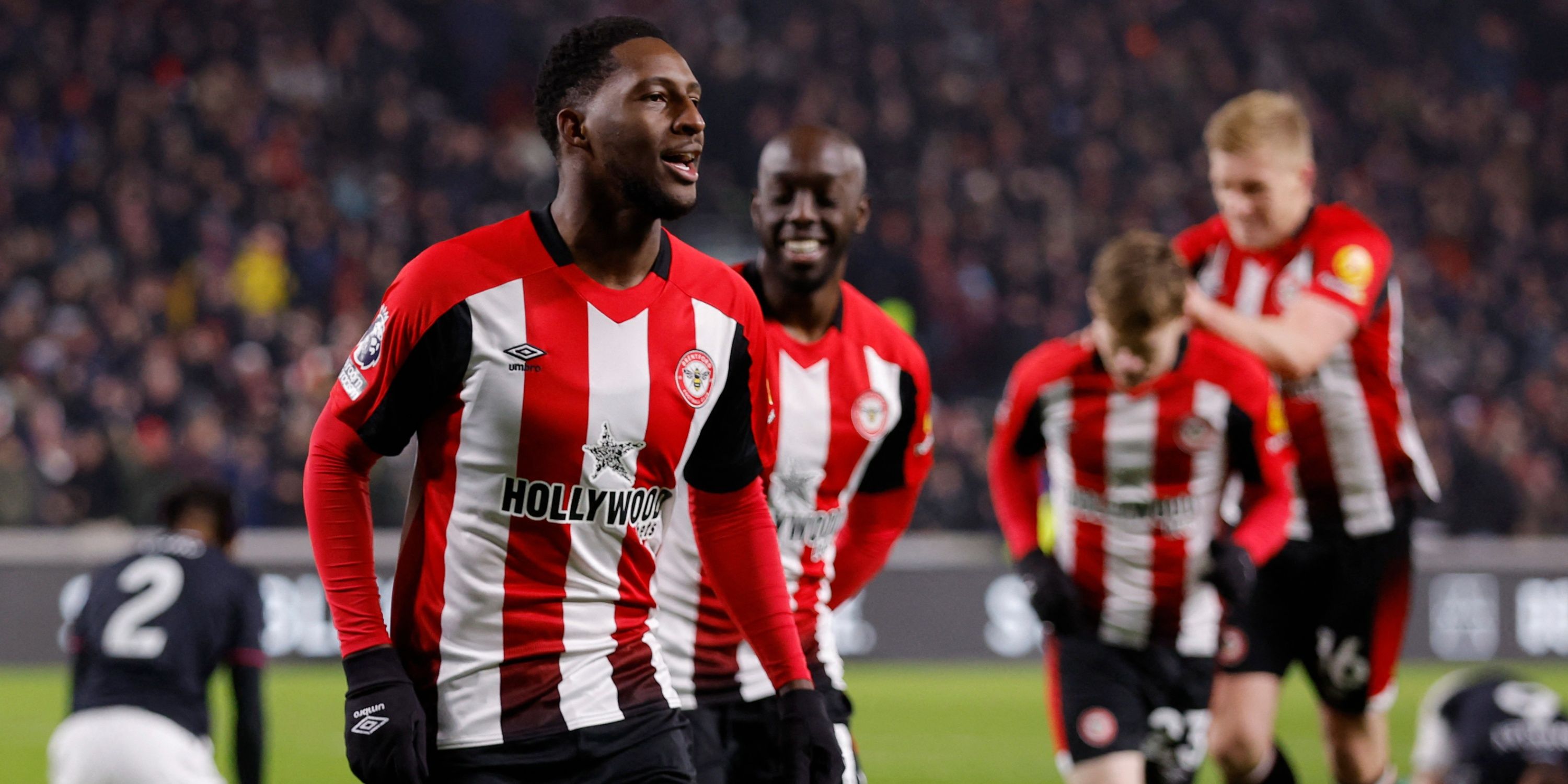
However, in the world of riches, Brentford have gone against the grain. Their kit is being carried over from the 2023/24 campaign as part of their efforts to save fans money and help the environment. Using their traditional red and white stripes, the Bees stood out with their bright colours. It has black trims along the sides, whilst it fades darker near the bottom.
Last campaign, Jon Varney, chief executive of Brentford FC, shared his enthusiasm about the new two-year home kit, stating: “We are proud to have collaborated with Umbro in designing this bold but traditional kit. This will be the fourth kit we have rolled over in recent years.
The two-year cycle not only ensures affordability for our fans but also aligns with our commitment to reducing waste and promoting a greener future for the next generation of Bees fans.”
Away
Another example of how less can sometimes mean more. This kit can easily be compared to Inter Miami’s home shirt, but Brentford have managed to take this gorgeous-looking pink and navy colour scheme and make it their own. With a penny collar and pinstripe cuffs, we can see this becoming a fan favourite of the Bees next season.
Third
Brentford will sport an all-green kit to use as their alternative jersey for the 2024/25 campaign. The Bees have looked at the architecture of the Gtech Community Stadium and opted to implement elements of that design into this kit, adding the same colours to the club crest. It also has a lime green trim that also features in the shorts and socks.
Brighton
Home
Brighton’s new home shirt takes a nod to classic designs of the past. Not just of the Seagulls but Nike kits in general with a look that appears to be straight out of the late 1990s with a modern slim fitting appearance.
The American kit provider have given the South Coast club extra stripes on their traditional blue and white kit in the form of white pinstripes in between, which are aesthetically pleasing to the eye, accompanied with blue shorts and white socks to complete the overall strip.
Away
The new Brighton away shirt is based on classic Nike kits over the years and also a modern look for the Seagulls. The club haven’t worn a kit like this before, so it is going in a new direction with a bright yellow design with tidy-looking black pinstripes.
Chelsea
Home
The new Chelsea home shirt has proved to be controversial as some have described it as “the worst ever” kit in the club’s history. The beginning of the new era under Enzo Maresca at Stamford Bridge kicked off with the reveal of a new home shirt that the first-team, reserves and beyond will wear for the 2024/25 campaign, and the unusual design has seen people sit up and take notice.
There are a lot of quirky marketing terms that are used to push the sales of a new kit, and this one is no exception. The Blues likened their new kit to the “hottest part of the flame” and uncovers the “burning passion” that seeps throughout the team and the club as a whole. The pattern also leaks into the new home shorts as well.
Away
Two weeks after the Blues released their home shirt, they made the grand unveiling of their all-new light beige away kit, with features of ‘tangerine orange’ and ‘rush blue’ as Nike describes it, with the colours seeping into the club crest.
It uses the same template as England’s Euro 2024 home shirt, and some would argue that it looks similar from a distance. Nevertheless, it is a clean and classy look which is a complete contrast to their adventurous-looking home kit for the 2024/25 season.
Crystal Palace
Home
Crystal Palace released their home kit midway through June 2024. It has a striking pattern of blue and red blended across one another, which is bound to be a ‘love-hate’ relationship for people around the world. The shirt also features embedded eagles and a commemorative ‘stamp’ on the back collar to celebrate 100 years since the opening of Selhurst Park. The kit is completed with blue shorts, also bearing the eagle pattern. It is available for £70 from the club’s main club shop, which compared to other Premier League sides, isn’t the most expensive.
Away
Palace’s away shirt have gone back to their more familiar yellow with an abstract eagle printed in a lighter shade of yellow and blue trim. The club badge has also been reduced to just the eagle itself with the ‘Crystal Palace’ banner typically found in the club crest, completely removed. This is the first kit that Palace have introduced to do this with the badge and have aptly named it the “Eagle Spotlight Kit.”
Everton
Home
It’s goodbye to Hummel and hello to Castore for the first time in the club’s history. Everton released their all-new home kit for the 2024/25 season in mid-July, going with a simple and clean look that Toffees fans around the world will likely appreciate.
The collar has a blue and white pinstripe design with a subtle navy geometric detail on the shirt itself. In the embossed print itself, there are details of the club’s first crest back in 1920 where the letters ‘EFC’ can be seen.
Away
Everton have opted to go with a black and yellow design for their away shirt, using just the club’s iconic Everton Lock-Up as the crest. The yellow trim is designed to mimic Goodison Park’s stadium lights and contains a modern geometric pattern.
Fulham
Home
Fulham released their 2024/25 home kit at the start of July 2024, and it offers a contemporary twist to a timeless and classic look. By partnering with Adidas once more, the company’s famous stripes are prominent throughout, whilst it is complemented by red wave side-detailing that runs throughout both the shirt and shorts. It binds “the kit together to create a sleek and seamless transition”, according to the club’s website. The stadium version of the shirt is available for £80 online, which is now typically the average price in the Premier League.
Away
A stunning example of a kit from yesteryear, Fulham unveiled their away kit which takes us all on a nostalgic trip back to 2001 which is what the new strip is inspired by. The Cottagers’ kit back then had a Pizza Hut sponsor and was famously worn by the up-and-coming young talent by the name of Louis Saha.
This famous red and black striped kit with white trim clearly commemorates those times in the early 2000s and has given it a modern look with the Sbotop shirt sponsor and WebBeds sleeve partner.
Ipswich Town
Home & Away
One of three Premier League newcomers Ipswich Town have arrived in England’s top tier with a classy duo of kits that will impress not just the Portman Road faithful, but also football shirt enthusiasts across the country and the world.
The home shirt features a navy blue V-neck with the traditional royal blue colourway, accompanied by white pinstripes and the Ed Sheeran sponsor that is slowly becoming more iconic. The famous double diamond Umbro logo, rather than being all one colour, features both white and red in the design.
It’s a similar story with the away jersey, with the Tractor Boys expected to don this up and down the country during the 2024/25 campaign. The club have opted to go with a maroon design with gold details, with a round navy neck and cuffs and an interesting geometric design embedded into the shirt itself.
Leicester City
The brand-new Leicester City home shirt was launched at the beginning of July and has certainly divided opinion as you can see above. While it may not be the most radical kit design in the world, the Foxes have gone with a clean and contemporary look regarding sports uniforms.
The East Midlands-based outfit have opted for tradition with a modern twist, that being the new shirt sponsor BC.GAME that accompanies their traditional blue home colours nicely, with white Adidas detailing and small details of gold, which echos back to the club’s Premier League-winning season back in 2015/16.
Away
Their away kit is arguably one of the boldest out of the 20 clubs in the Premier League, going with a fiery design that contains orange and pink accents on a black shirt, with the design going into the shorts as well. Leicester are expected to release a third shirt as well, when that is, remains to be seen.
UPDATE: 2024/08/09 15:24 EST BY NATHAN LINLEY
Ipswich Town and Ed Sheeran launch new third shirt.
Third
A stunning and unique look to commemorate the club’s most famous supporter. Designed in collaboration with the award-winning Ed Sheeran, Ipswich Town introduced their all-new ‘Suffolk Pink’ shirt that is inspired by the county’s countryside.
Along the chest of the jersey features a silhouette of Framlingham Castle, which is known to be the meaning behind Sheeran’s song ‘Castle on the Hill’ It also has ‘Ed Sheeran x Ipswich Town’
Liverpool
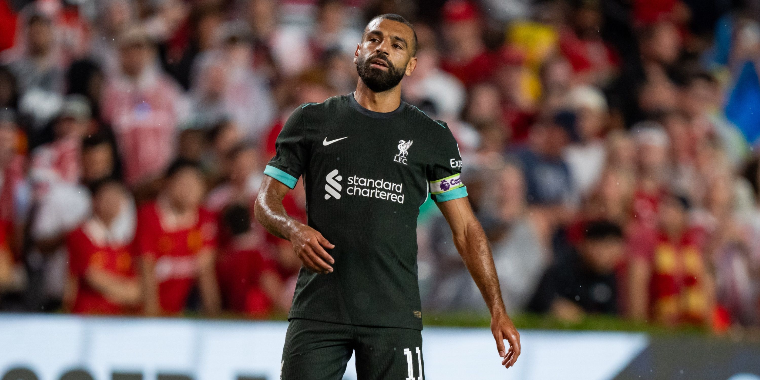
Home
Liverpool start a new era with Arne Slot in charge. Change is always scary, particularly when the man leaving is one of the club’s greatest managers of all time, yet they wore their new kit in his final game in charge, marking the new dawn. The jersey was released at the start of May 2024 and it is inspired by the club’s memorable 1984 team, who lifted the European Cup in Rome.
It features a chrome yellow pattern of the club’s ‘You’ll Never Walk Alone’ motto etched into the fabric of the shirt. Meanwhile, the jersey has a unique collar with traditional yellow and red detailing to commemorate the team from 1984. Both the shirt and shorts have yellow and white side panelling. It stands out from the crowd, whilst Nike’s advanced dri-fit technology helps the players to stay dry and comfortable throughout the match.
The kit is sustainably made, with on-the-pitch and replica jerseys constructed with 100 per cent recycled polyester fabric, which is made from recycled plastic bottles. Plastic bottles are collected, cleaned and melted down to produce a high-quality yarn for manufacturing. At the time of the announcement, club captain Virgil van Dijk said: “I’m a big fan of our new kit for next season and love the fact we’re bringing the retro vibe back.
“We are a club built on history and the 1984 team was one of our most successful ever. I’m sure our fans will appreciate the nod to those club legends.”
Away

Related
Arne Slot Named Santiago Gimenez During Liverpool Talks
Arne Slot formally began his tenure as Liverpool head coach on June 1
Man City
Home
In the 2024/25 campaign, Man City will be dreaming of winning the Premier League for a fifth year in a row — a feat no team has ever done. They have already gone down in the record books as one of the greatest teams the competition has seen, but they always want to push on.
As the previous campaign came to a close, the Cityzens released their new kit during the title battle. It is designed with ‘Manchester in its fabric’. The sky-blue jersey features threads of 0161 in the trim — a reference to the club’s roots. It was a dialling code in the area, but if you take a trip to the city now, you will see it written on lampposts on every corner, epitomising what it means to be from the area. Apart from that, the club have opted for a relatively simple kit, choosing simplicity over chaos. They will hope that will be replicated in their campaign.
At the time of the announcement, Serena Gosling, director of integrated fan experience and retail & licensing, at the club, was proud of the idea, stating: “By incorporating ‘0161’ in this year’s Home kit – something that resonates so strongly with the City of Manchester – we’re able to connect fans around the world with the club and our city in a different way.”
Away
Third
Man Utd
Home
Manchester United unveiled their new home kit for the 2024-25 season at the start of July. The traditional red shirt, which is famous around the world, is matched with white trim and white shorts. Meanwhile, Snapdragon began their stint as the main sponsor, after a £60 million deal was struck with the American tech firm to replace TeamViewer. Adidas are behind the new kit’s design, which is inspired by a “fluorescent” concept introduced during United’s famous Busby Babes era to help the players spot each other under floodlights. Their away and third kit have not yet been revealed.
Away
Using the marketing motto “for the fearless,” United released another blue away shirt, this time using darker shades of blue for the 2024/25 campaign. Adidas officially calls the colour “night indigo”, which is combined with light silver logos, red accents, and royal blue trim which comes from the shirts used in the late 1960s. Labelled with the all-new Snapdragon shirt sponsor, it also has an interesting zig-zag pattern embedded into the jersey that is made of the letter M. It is radically different to the away shirt that we saw from last season.
Third
UPDATE: 2024/08/12 11:38 BST BY NATHAN LINLEY
Man Utd reveal new Adidas Trefoil third kit.
Similar to Arsenal, United also opted to use Adidas infamous Trefoil logo as part of their new third kit for the new season. They also opted to use the club’s devil as the crest for the second campaign in a row – as well as black and red stripes across the chest similar to what flags the supporters carry on the terraces home and away.
United’s is one of two Trefoil kits across Europe that doesn’t go with a collar, but instead uses a round collar, and is also available in a long sleeve version.
Newcastle
Home
Newcastle have made the switch to Adidas for the 2024/25 season. Puma and Castore have had the rights from 2010 onwards, but the club confirmed a new Adidas kit deal in September 2023, with the announcement referencing the era when the Magpies came so close to winning the title with Alan Shearer; that came whilst they were with the German giant.
They’ll be hoping it can provide a catalyst this time around as well. The kit is simple but effective, with black and white strips going vertically alongside one another. The iconic Adidas badge and stripes add another sense of beauty to it. Eddie Howe’s team have not yet confirmed their away kit or third kit.
Third
The Magpies have acknowledged their past with their incredible-looking third shirt. While it might not get a lot of on-pitch time during thre 2024/25 campaign, it will certainly be one of those kits that will fly off the shelves.
Using the slogan ‘mint’, the white-based shirt have reintroduced their club crest from the 1980s that was sported by club legends such as Paul Gascoigne and Peter Beardsley. It takes inspiration from the 1999/00 away shirt, also made by Adidas.
Nottingham Forest
Nottingham Forest released their new home shirt in mid-July 2024 and used the all-new Adidas template similar to what Arsenal and Manchester United have implemented for the 2024/25 in their respective home shirts.
The Reds introduced a new design that recognised the club’s two European Cup wins in 1979 and 1980 under the late Brian Clough, with overlapping stars in the textured pattern of the shirt itself.
Southampton
Home
Southampton have moved away from Hummel and gone back to their football kit roots with Puma and their new sponsor Rollbit, brandishing their famous red and white stripes with classy-looking black trim.
The stripes point down at the base of the shirt which almost look like teeth, giving an aggressive appearance to the jersey, which differs greatly to the half pinstripe, half red strip that the Saints wore last season in the Championship. It is a refreshing look for the South Coast outfit that we think will go down well with the club’s supporters.
Away
Southampton’s away shirt goes for more of a funky design with an interesting deep yellow geometric pattern with lots of chequered boxes and triangular stripes, all layered on top of a fluorescent yellow shirt with navy trim along the collar and the cuffs. This shirt will be accompanied by navy shorts and yellow socks, with the crest on the top itself coloured to match.
Tottenham
Tottenham released their new home kit at the start of June. Released via a quirky and entertaining video, the shirt sees Spurs return to navy arms for the first time since 2006. The traditional white is kept as the base colour, but the navy trims make it stand out, despite the red ‘AIA’ sponsor not being popular among the fanbase. However, it costs £85 for fans to purchase the stadium edition, which has also drawn criticism.
The kit is made from Dri-FIT ADV, an innovative fabric designed to help keep players cool throughout the match. The kit will be worn for the first time during their first pre-season fixture against Hearts on Wednesday 17th July. Spurs also became the first Premier League side to release their away kit for the 2024/25 season. It is inspired by the iconic shirts worn in the early 80s by the club. The crest features in the centre of the jersey to provide a futuristic twist to a classic Nike design. Meanwhile, the sleeves and neckline include a yellow and white tape which runs as a consistent theme through Spurs’ jerseys. Just like the home shirt, is also available for an expensive £85.
West Ham
Moving on, as West Ham embark on a new era without David Moyes as manager, they unveiled their home kit before pre-season for the new Premier League campaign. It features the club’s traditional claret and blue colours while paying tribute to the teams and players who paved the way for the team’s success.
Inspired by their success in the 1960s, which was the first time they tasted major European and domestic glory, it is a throwback to the past. Coupled with a round neck and claret detailing on the sleeve cuffs, it also features a new commemorative Umbro diamond logo, which has been designed to mark the famous British sportswear company’s 100th anniversary. Their third kit have not yet been revealed.
Wolves
Wolves unveiled their new home shirt for the 2024/25 Premier League season in July. There are several differences from last season’s shirt with new front-of-shirt and sleeve sponsors, a new kit manufacturer and, for the first time in 45 years, the club badge is located in the centre of the chest. It isn’t the boldest design out there, but their traditional colours provide a sense of continuity as they look to rise up the table. It is available for £80 — or £70 if you would prefer the long sleeve option. Their away and third kit have not yet been revealed.
About Author
You may also like
-
Michael Carrick opens up on Manchester United future
-
What Happens If Arsenal and Man City Finish on the Same Points
-
Kompany targets Osimhen as Kane successor, but Man United and PSG not keen
-
Christian Falk reveals Bayern Munich stance on Michael Olise amid Liverpool interest
-
Guessand Needs Five More G/A for Permanent Move
